


02/28/25: CRUELLA COUPE DE VILLE
A surprise appreciation of 101 DALMATIANS

Hey y’all,
It’s been a while since I’ve done this— but today I’m going to use this space to work out the loose beginnings of a future DRAWL video. Just some initial observations and thoughts on today’s subject: the beginning of Disney’s Xerox era of animation.
But before you wade into this--please know that it's written by someone who doesn't really worship Disney-ness. If it's your thing? Hey, cool. Believe me, I respect the power of the endeavor and the imagination. But speaking oh so broadly — it’s not my favorite jam.
Still, that said, I'm about to sorta gush over a Disney movie. So y'know riddle wrapped in a bullshit-flavored engima over here...
Quick confession--
As a person who makes stories by drawing, I find it a bit of a bear to watch animated movies at times.
My biggest reason, or excuse, for such a weighted wet blanket of a statement, is the pesky hard-wiring of how my brain handles processing a story. At my age I've done enough movie watching and story making to know how to set most of my personal ambitions and pre-conceptions aside and let a film wash over me. To give it a chance to be different than what I would want it to be in my hands. Yet still there remains this sleeper program at the back of my consciousness that's sole function is to work on working out “HOW and WHY they did THAT?”— A voice that is particularly hard to soften when it comes to stories with drawings and paintings in them.
For this, I blame my background in the most reverse-engineered art form ever— comics. A medium where looking for the hand of the person who made the work is essential to the process of learning to make your own.
In those terms, the classic Disney animated movies couldn’t be more opposite of comics. As they were quite literally an army of artists working in service to Disney’s strict stylistic philosophy of lush, romantic fantasy. A mandate that codified a hydra of artistic talents and points of view into a symphony. An approach that produced art that I admire and appreciate. That I often really, really like.
But when the dinner check comes? Well…
There’s only one era of Disney movie that gets me racing for my wallet…
The post-Walt, xerox era of Disney films was a faster, looser, more reckless period. One that, while oft derided for its thin stories and cost-cutting measures— is so visually innovative and satisfying that it sets my art-making loins on fire.
So today I want to talk a bit about the first of those movies- 1961's ONE HUNDRED AND ONE DALMATIANS. A movie that may have saved cinematic animation, and killed Walt Disney in the process.
(Relax. I'm joking.)
(That was cigarettes.)*
By the late 1950s animation was becoming far too costly to continue in the manner that Disney would prefer. And so rather than completely abandon the art form that had built his empire he looked to his ‘ol buddy Ub (Iwerks that is) to find a cheaper, faster way to make cartoons.
Iwerks' solution was the Xerox machine. A newfangled process that bypassed (cough... laid off...cough )the traditional assembly line of inkers who traced and embellished animator’s pencil layouts onto acetate. In simple terms it allowed Disney to put transfers of those pencils directly onto the screen.
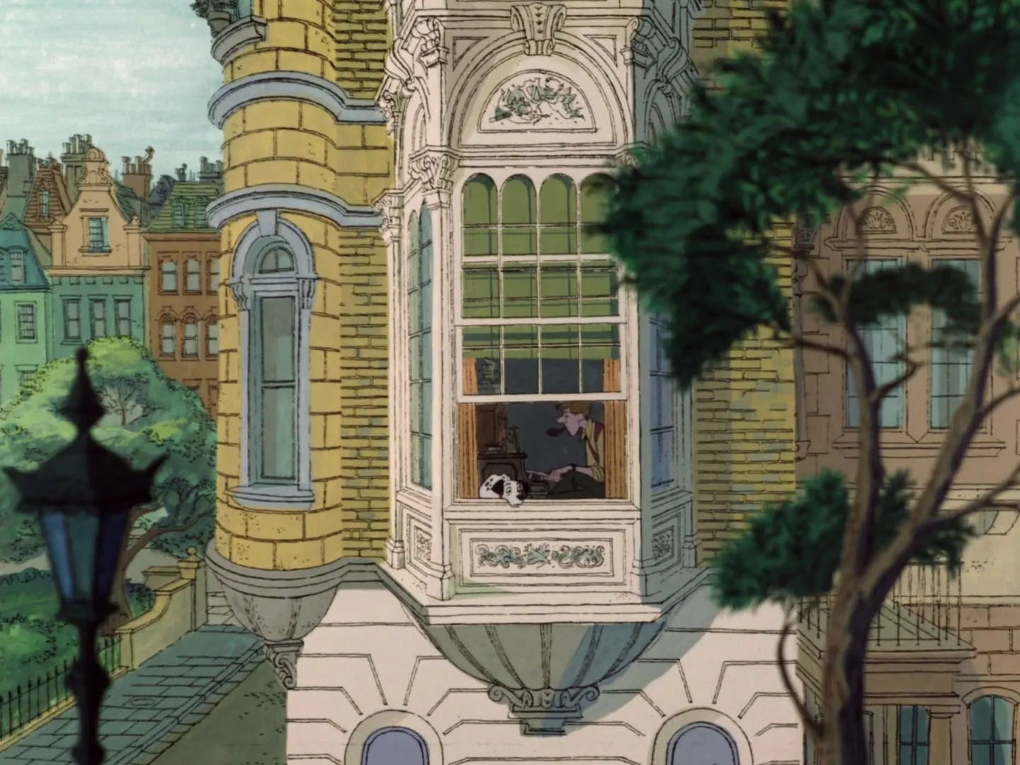
Aesthetically, without a second artist working to re-interpret the layout— the original drawing is pushed to the surface. Rending bare a more binary outcome of hard edges and empty spaces. A graphic representation of ON or OFF that elegantly echoes the black and white of the Dalmatians themselves.
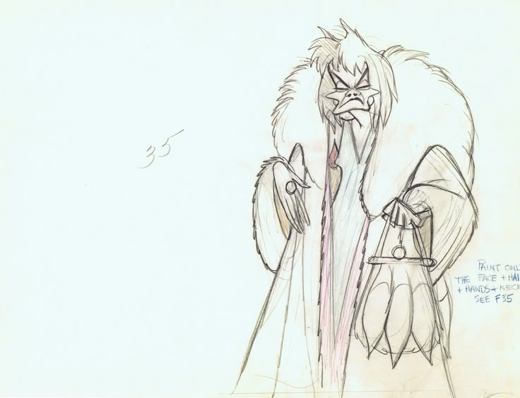
To stick out in a world of cluttered attention spans, art director Ken Anderson made the seemingly counter intuitive choice to embrace the power of that reduction. A methodology that required a deep consideration over what goes and what stays. In how much room each choice leaves for the audience to put their own imaginations.
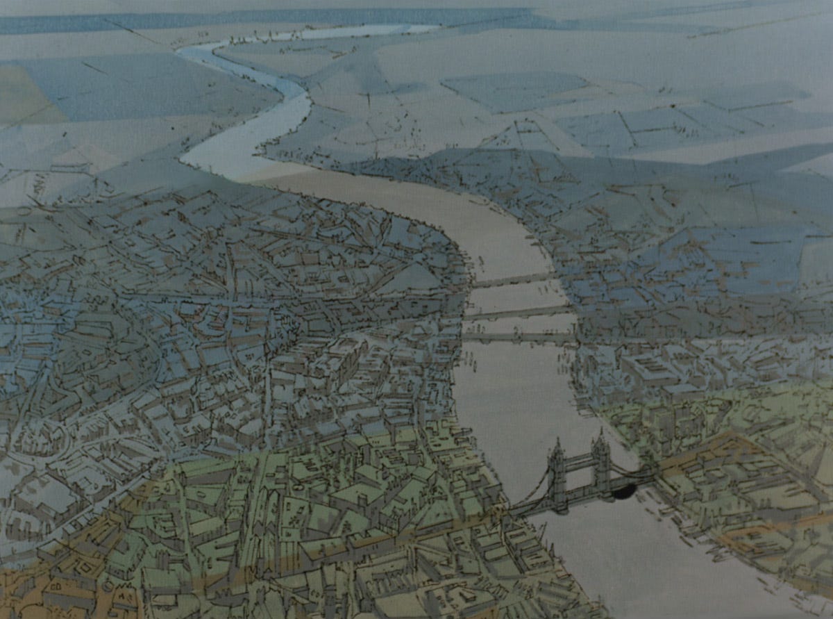
A visual approach that is perfectly captured by an ultra-contemporary opening title sequence— a little music video that works as a statement of intent. That says— hey this is a modern movie, in a modern setting. Influenced by modern artists. Some of whom may even enjoy recreational drugs on occasion.**
And so in the production of a movie with an unholy amount of baby making— this consummation of form and function had somehow ironically stripped Disney’s vast animation pipeline down into a leaner, meaner, more agile beast.
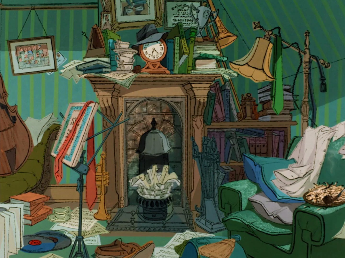
Without the re-interpretation of a graceful ink line to help Dalmations along— the life of the onscreen drawings falls to the line weight of the initial artist’s pencil. You can almost feel the trailing swoops of the lead in the underdrawings as they crackle and flicker by. Undulating between starts and stops. Emphasizing the journeys between lines and shapes. A little drawing drum solo here. A guitar riff. An acoustic set. Disney unplugged.
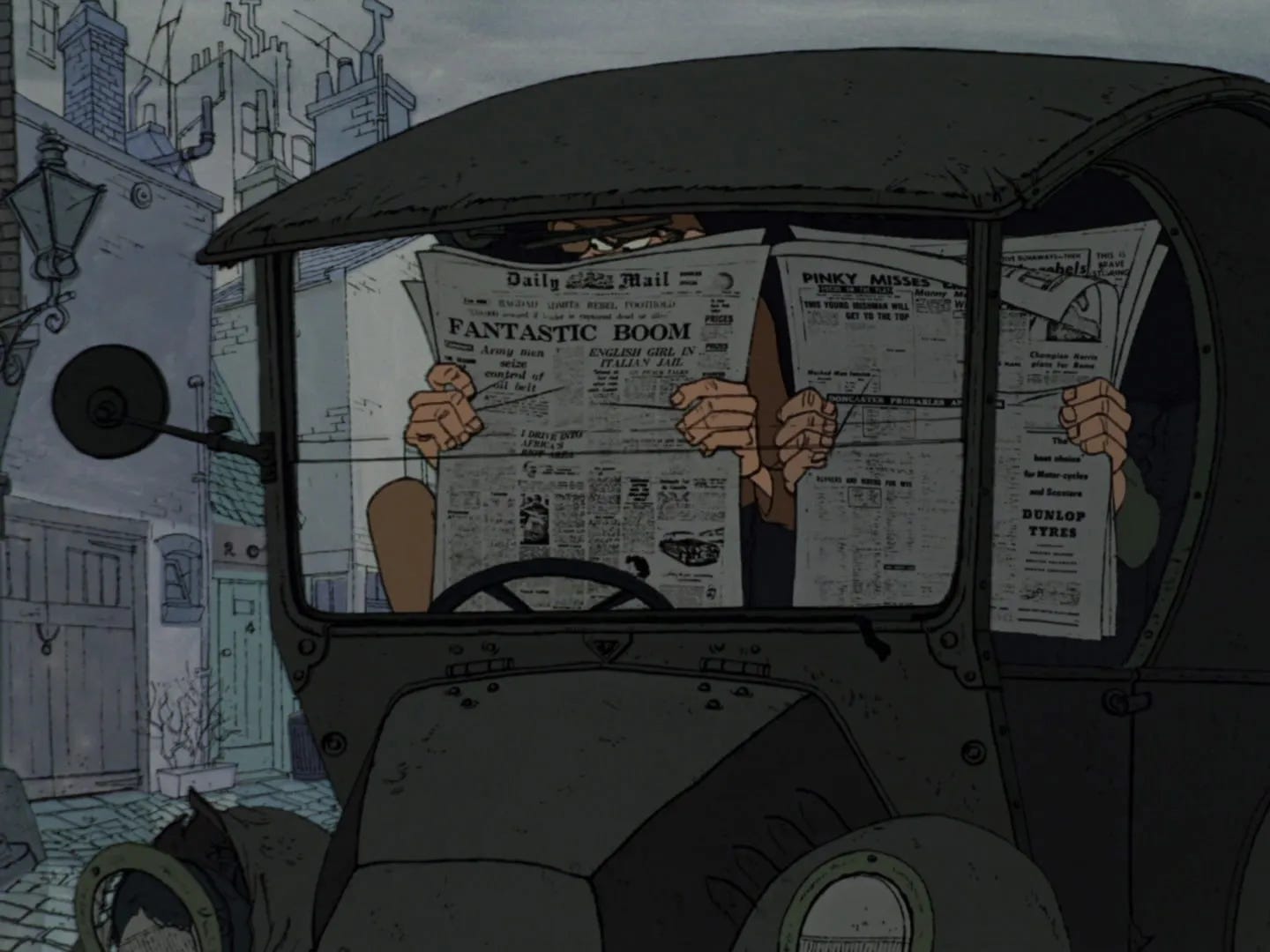

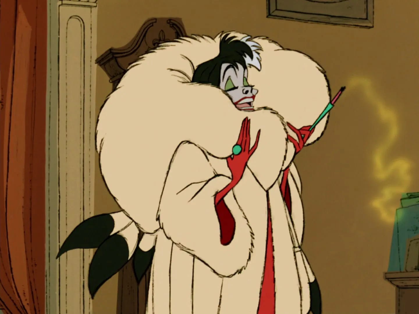
But this binary Xerox approach extends beyond Milt Kahl or Marc Davis’s expertly rendered characters— the wide majority of the backgrounds themselves remain graphic. Static black and white line drawings whose hard edges fuse and mesh with the animation. Creating a graphic, holistic, illustration styled language.
The massive amount of detailed environmental drawing is smartly juxtaposed with the exquisitely spare designs of the characters. Working in tandem with the broad swaths of color—those backgrounds create believable lived-in spaces, simply by never allowing our eye to completely rest. Our imaginations are pushed to take in the information without lingering. To believe without questioning too much.
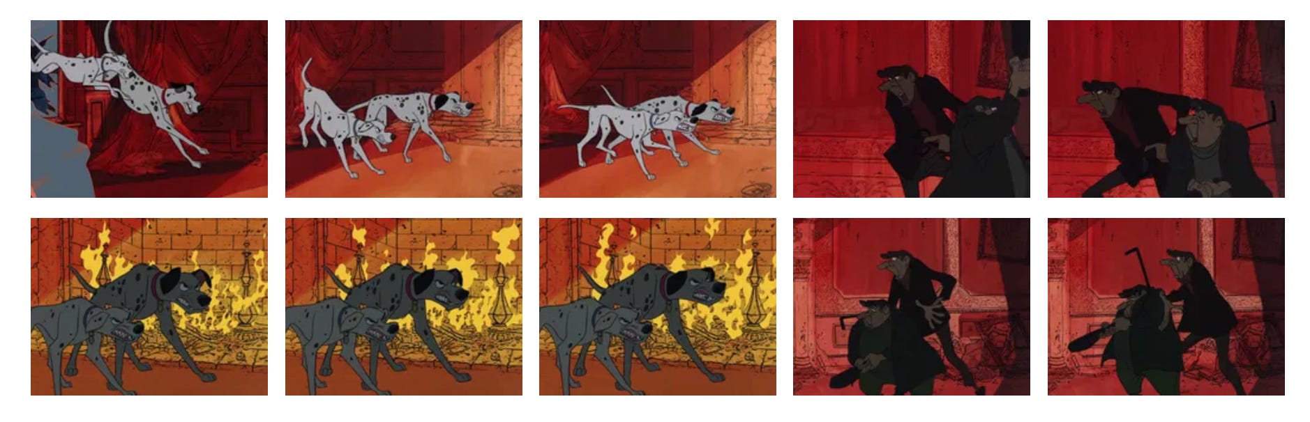
In fact, look closely you’ll see that the underlaid color itself is often slightly off-kilter. Marker and paint streaks bleed into shadows and past boundaries. Everything is akimbo. Staccato. Colored just outside the lines.
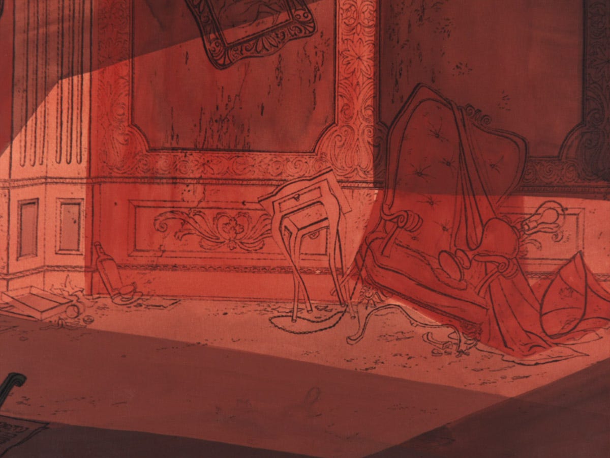
And that palette— what a refreshingly atypical array of muted grey-blues and greens— set against pops of complimentary brightness. Dark silhouettes that form frames. Shadows that fall across characters to completely change both mood and tone. Colors that overwhelm whole shots at times— abstracting things in a way that doesn’t hold with Disney’s typically literal light source kind of approach.

And then— when you just didn’t think it could get any bolder—
There are the cars.
Those beautiful goddamn cars.
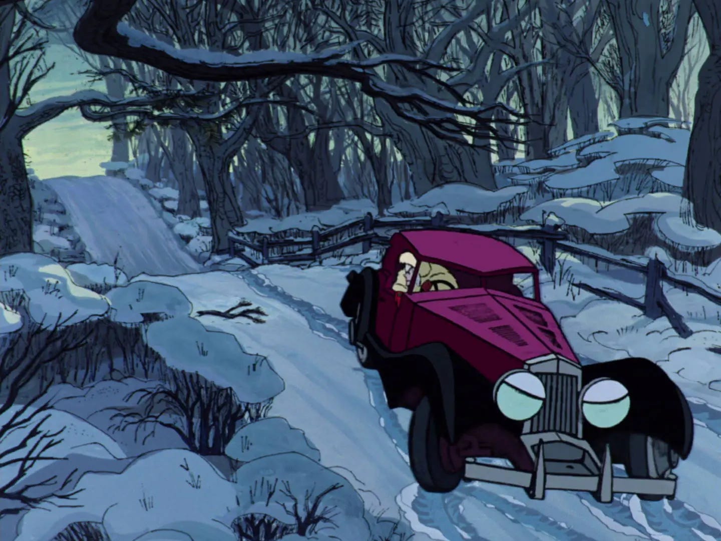
So well designed and animated that they feel like physical, 3-dimensional models— because guess what? It turns out— THEY WERE!!
Just another ho-hum, crazy seat-of-the-pants innovation in an animated movie about the attempted genocide of London’s talking puppy population.***
1961, when cameras and abstract art were dueling for supremacy of reality— this narrowing of focus and concern feels like it emboldened 101 Dalmatians.
Almost as if it took the challenge of figuring this out to allow these great artists to throw off any concern about how they play and just get to jamming.
And as industry redefining obstacles go?
Would that we all could be so lucky.
*C'mon--unclench. Everyone knows his frozen head is still alive.
**Doing a quick bit of research I learned that this is the first Disney animated film that was both not a fantasy (meaning it's set in a contemporary world) and not a musical.
***The story itself doesn’t particularly light me on fire from start to finish. But it definitely has its charms. And some kind of holy shit things like Cruella’s insane one track plan, and a reincarnated puppy, and cigarettes and gunplay,… and… and… and…
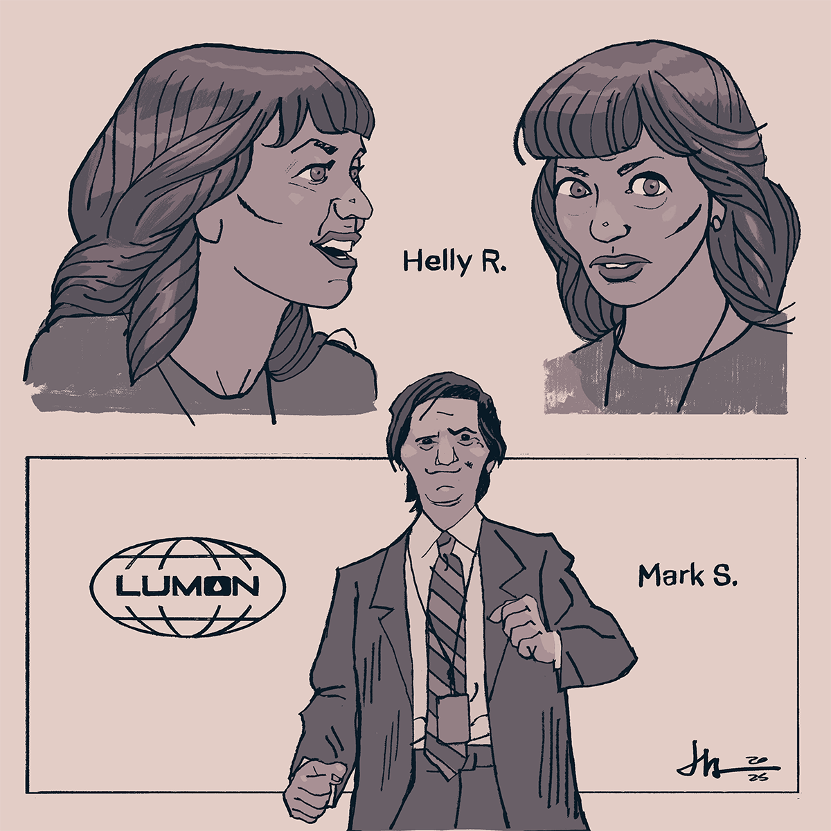
That’s about enough for today. But since I hate making these posts without including a little art of my own, here are a few studies of Ben Stiller’s Apple TV show SEVERANCE. Which is itself kind of a visual storytelling oasis amidst a growing sea of shows that just want you to play them in the background like elevator muzak.
If you’re watching the show, let me know what you think of the new season… and maybe my drawings?


Anyways, I hope you’re all as well as can be. Have a great weekend.
More soon…
-j
love this piece
great writeup. had NO idea about the cars. fascinating.