


03/05/25: (MIS)LEADING THE BLIND
Blurry memories of making DAREDEVIL comics

Hey y’all,
Loathe as I am to lean into a shameless trending topic kind of entry— the arrival of Marvel’s newest take on a DAREDEVIL television show does provide a nice little excuse to fire up the way-back machine. So today let’s briefly travel an astounding 15 years into the past— back to my first real Marvel comics job: DAREDEVIL BLACK & WHITE #1.
These days I like to pretend that I can distance myself from the influence of superheroes or my time spent working on them— but the truth is that booking this job was a really big deal for me. The conceptual mandate that the book be black and white meant that it was, in a rather clever way, sort of homaging/riffing/stealing some artistic valor from the BATMAN: B&W comics anthology that had begun 14 years earlier. Studded with stars, that series was essentially the rarest of things— a commercially viable artist’s showcase.
But come 2010 comics were a different beast—so while this Daredevil gig had noble ambitions, it faced different publisher mandates and company philosophies. So instead of a superstar you got my fresh off the turnip truck ass.
Either way, the gig did come my way, as Chris Brunner recommended me to editor Jody Leheup after passing on it. I eagerly accepted, excited to play with a character whose comics I had found extremely influential. With the bonus that Jody’d tapped Peter Milligan as writer— an esteemed talent who lent the weight needed to counterbalance how light in the ass I was as a headliner.
In the end, the comic that came together was far from perfect, or “important” in any way, but it is one of the rare early professional efforts that I don’t mind looking back at. Mainly because I really, really, really bled for it. Like… damn near out.
Given how far it is in the rear view, it’s hard to say that any current insight I have into these pages would be that accurate. And more honestly, I don’t love giving commentary all that much these days. But since this was mostly a job, and you’re still reading— screw it—here are a few thoughts…
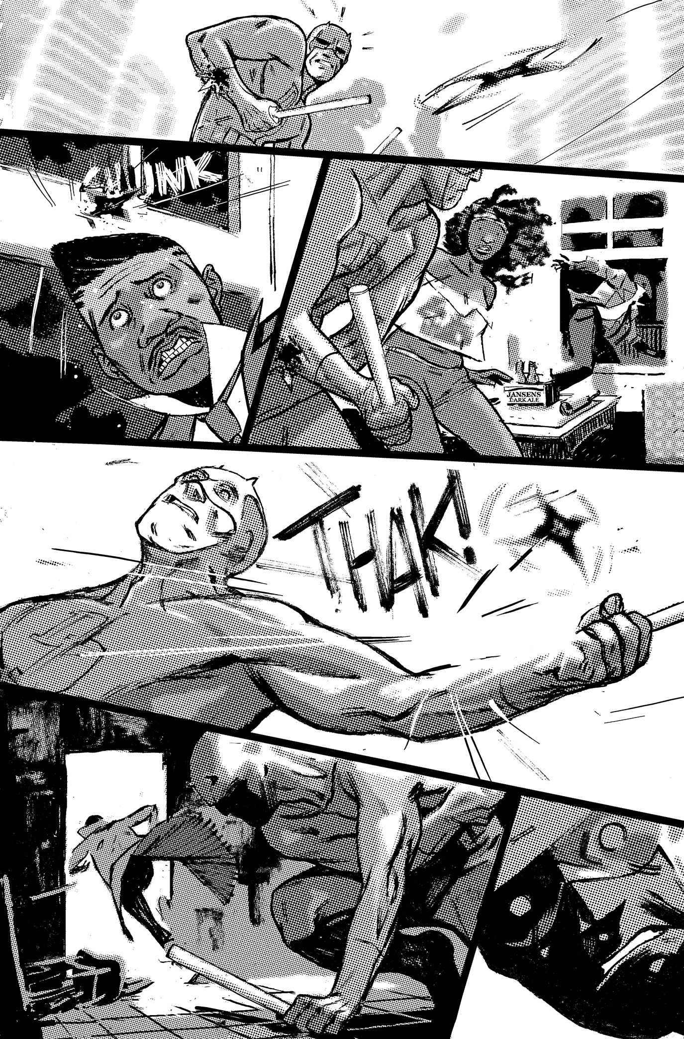
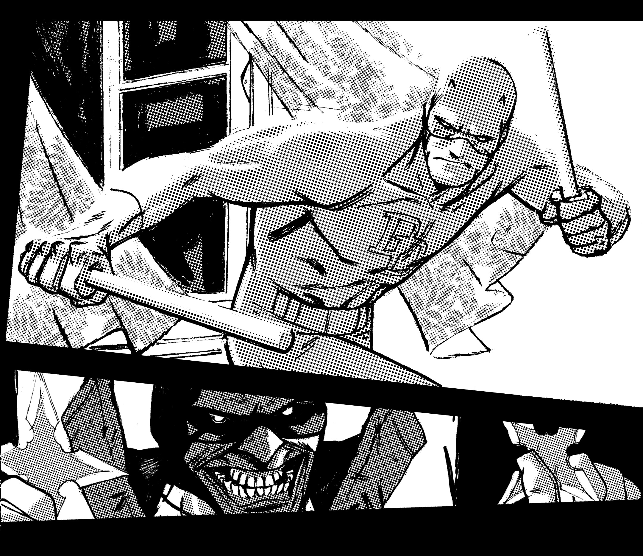
-The half-tone approach was my effort to give some tonal range to the pages while still adhering to the mandate that the book be a binary black and white. It felt very important to me to stick strictly to that conceit. Otherwise, it’s a normal comic.
- A couple of folks told me that Marvel would never, ever let me get away with giving these characters such cartoony expressions (i.e. dots/circles for eyes). But as it turned out, editorial didn't seem to notice or care. Either way, I’m glad that I didn’t cave on that, as just that tiny amount of leeway really emboldened me to trust and remain myself artistically while doing work for hire.
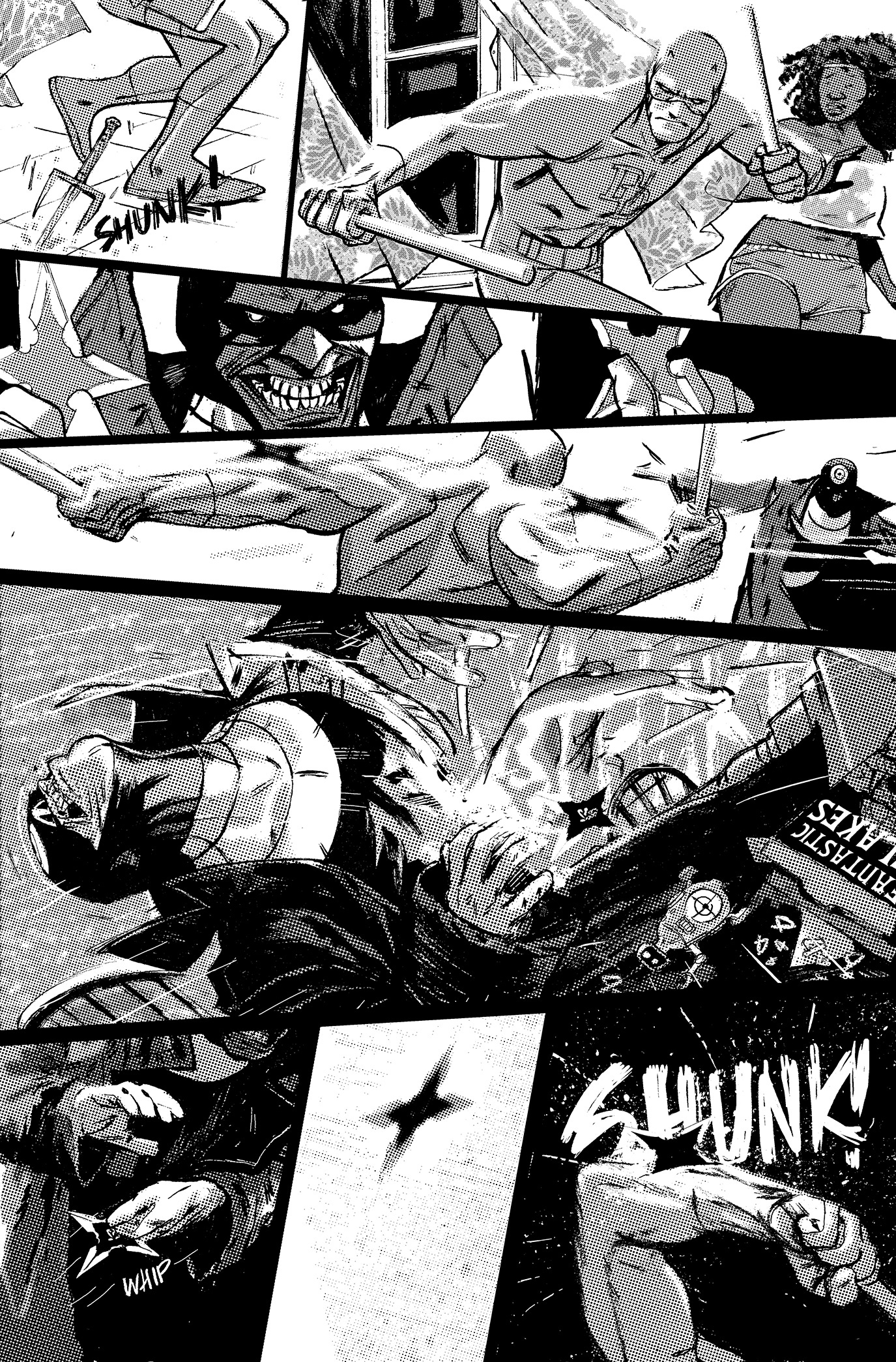
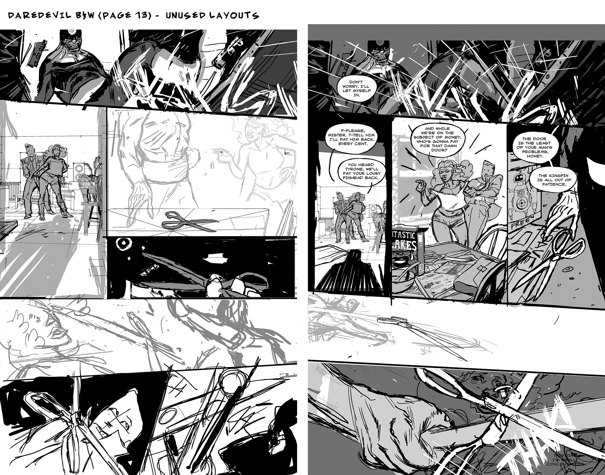
-Page 13 took literally 15 passes to arrive at the final. I don’t remember what the script called for, but for some reason, I was committed to the villain, Bullseye, using a found/common object as a weapon. But in that limited space, it was damn near impossible to set up and pay off anything that he could throw with enough authority to feel deadly.
Eventually, I tossed up my hands and went with a “guy with a trench coat full of watches” style solution in order to give Bullseye a ridiculous arsenal of ninja weapons. A little personal defeat that I do think added some much-needed comedy.
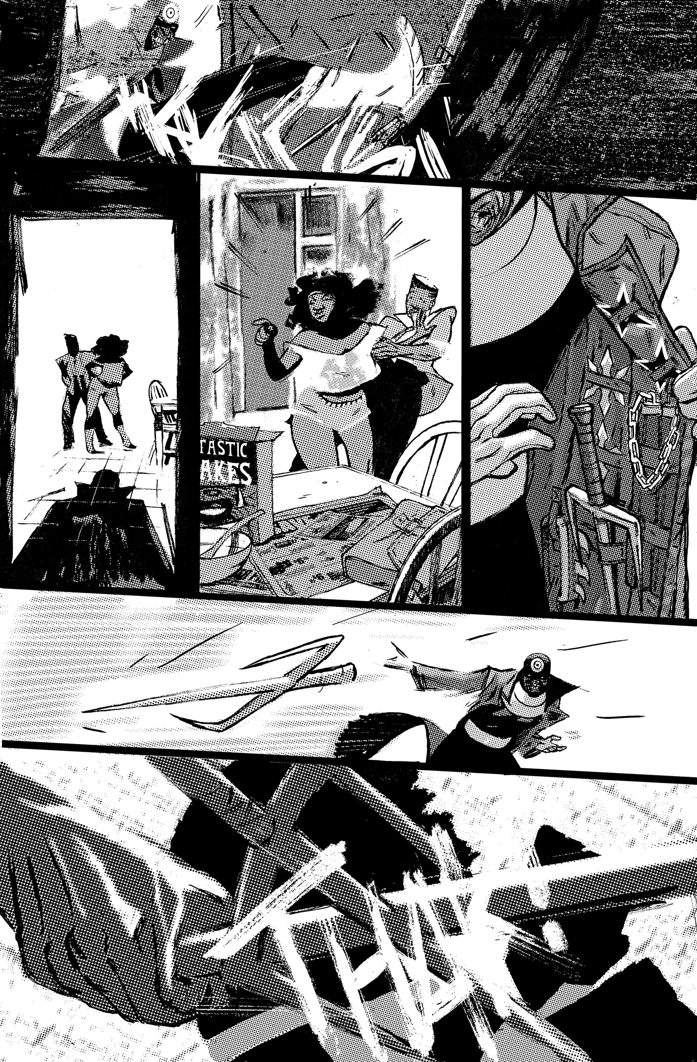
-The effort was to make it feel like you were in Matt’s mind. The POV shifts between seeing through Matt’s eyes, and watching him from a slight remove were meant to imply that both seeing and being seen were new experiences.
It’s also part of the reason why the design of the pages begins fairly orderly and grid like at the start (some times even split into halves) and then sort of shatters to become jagged and off kilter.
-Given that the whole story is a dream about Matt/Daredevil getting his sight restored, I tried to include a lot of overly coincidental things from Daredevil comics canon that Matt Murdock wouldn’t recognize by sight. Both as a joke and as an attempt to add to the dream-like surreality.
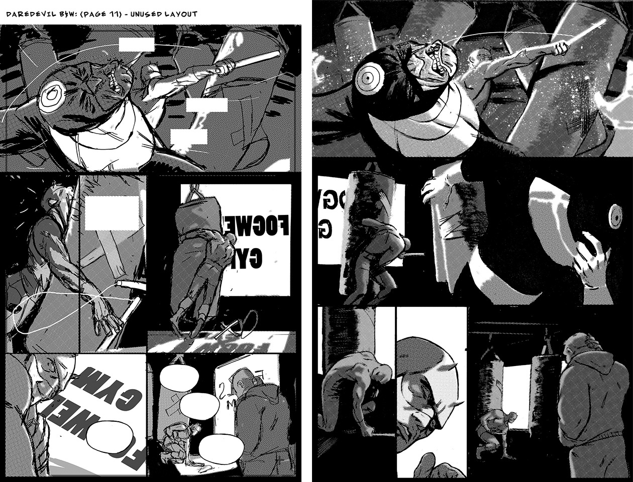
-I still prefer the original layout to page 11. It just has a slightly better flow/ambiguity and was an homage to a David Mazzucchelli panel in BORN AGAIN. Jody Leheup was beyond great editorially, and really empowered me to run wild— but I think he may have asked me to change that because Marvel didn’t like Daredevil looking so weak. And/or you lost track of how Bullseye got away.
-On a deadline I nail my layouts down as tight as possible, in case I have to rush the finishes. So maybe what I call a layout other people would call pencils, or prelims— or boards.
-Here’s a full comparison of the layouts vs. the final pages. Comics are of course pictures AND words— so you may want to track the comic down and actually read it:

-The empty balloons and boxes you see are my placements for text. They are not just guesses, but actual placements, as I always have and always will go through and do my own lettering pass as I design pages. If you take nothing else away from this about drawing comics— please take that advice. Page and panel composition is everything to me, but like it or not nothing leads the eye more than the balloons.

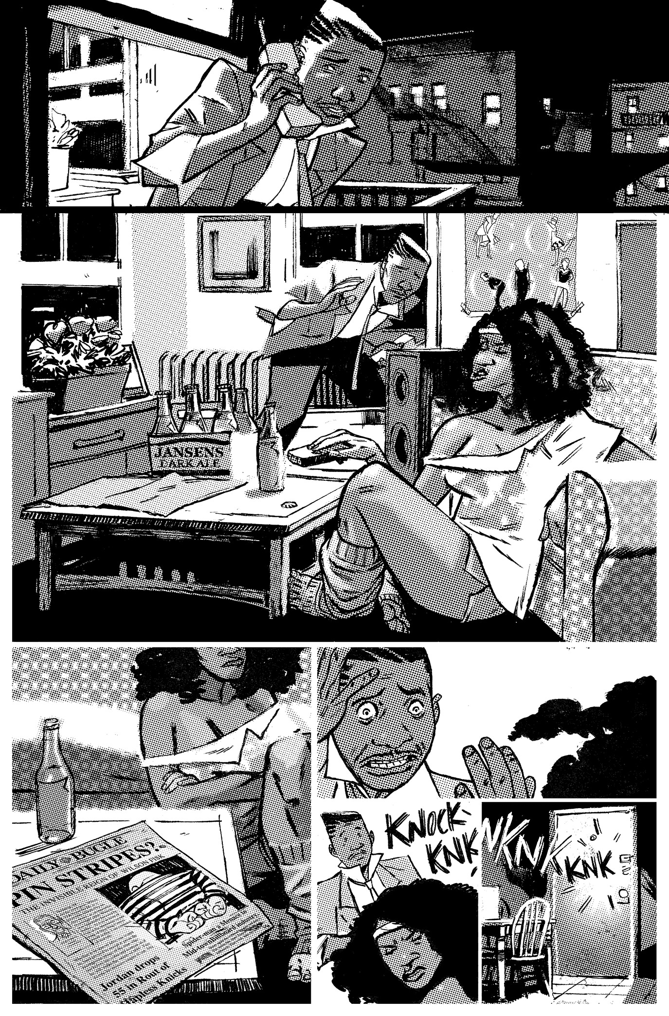
-At the time I actually thought the “PINSTRIPES” headline was clever in a NY POST kind of way. Now I don’t know if it should have been “pen” like jail or “pin” as in Kingpin. I can’t see the forest for the trees on that one.
-Speaking of newspapers, that’s supposed to be Martin Scorcese reading the Daily Bugle in the coffee shop. Though truthfully that was about putting Spider-man on the paper's front page— because I didn’t know if I’d ever get to draw him in print for real. Same goes for The Thing and H.E.R.B.I.E. on the cereal box.
- It turns out that I did get to do a fair amount of Spidey and Daredevil stuff. As there was nothing haphazard about Matt Murdock’s role as SPIDER-GWEN’S main antagonist. It was the most natural of impulses but the decision to have him turn heel really galvanized my thoughts about that entire world. And that unbridled, devilish take on Murdock was fun to write.
-There was a brief moment around 2018 when I was in what felt like serious talks to write and draw the DAREDEVIL ongoing. I made some pretty ambitious and comprehensive plans, but they fell apart relatively quickly and mysteriously. Which was hard to take at the time but was ultimately for the best. My story was likely too weird to live.
Anyway, I understand that was a rather overly indulgent look at such a slight work, but it was important in my little personal story. So I hope you did get something out of it. Particularly those of you who make comics.
Hope y’all have a great week.
More soon…
-j
Brilliant stuff, lovely Greytones too, reminds me of Brunner's 'Chinese' strip in The Ride. When did you switch from analog to digital art?
Do you have any concept work from that Daredevil book? Loved your Batman concept work!