


09/12/22: Covering Jim Lee's X-MEN #1

So… I finally finished my re-mix of Jim Lee’s X-Men #1 :
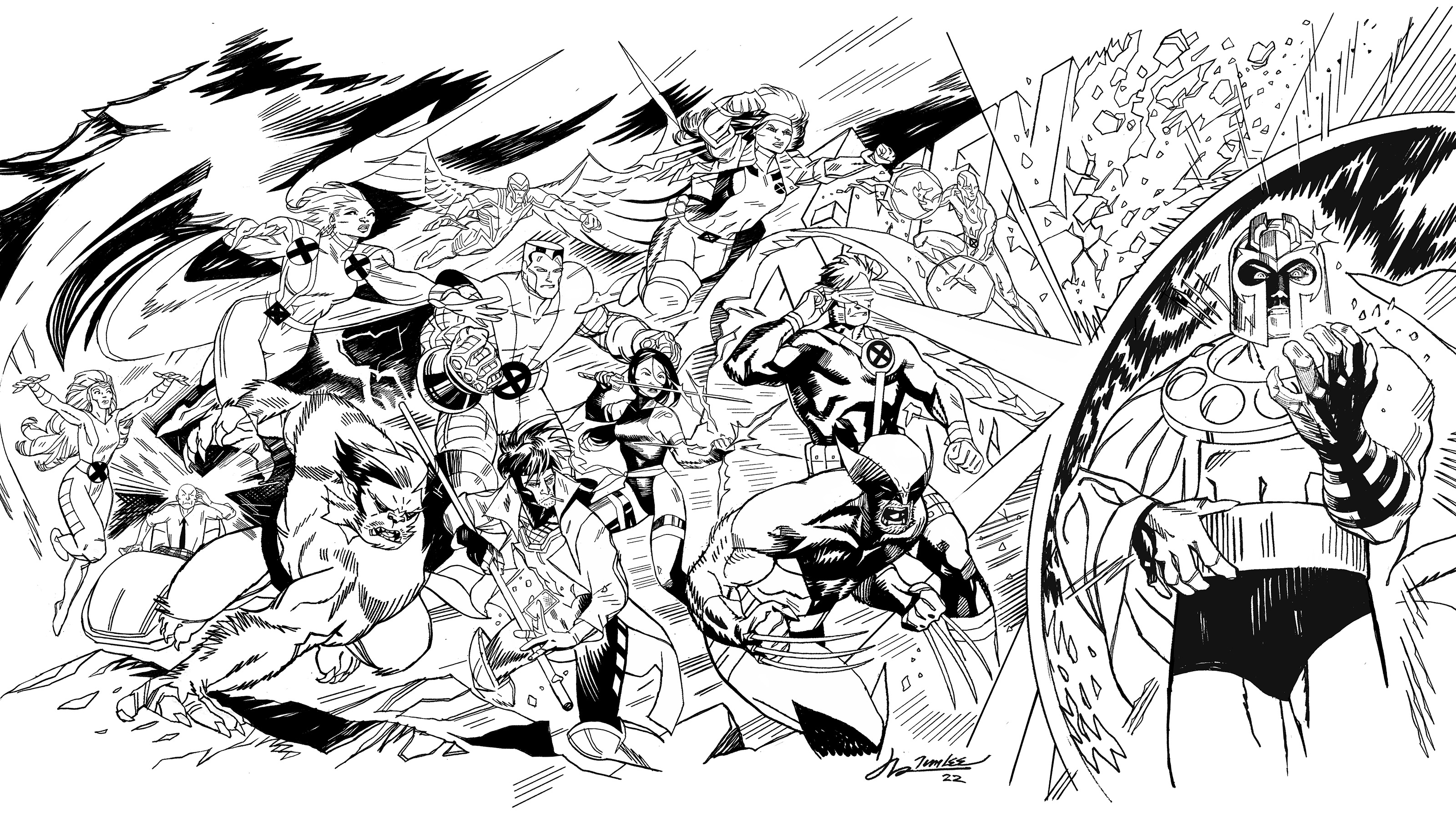
As promised, here are some thoughts on what I learned in taking on this ridiculous, yet enjoyable task.
The 15 years of Uncanny X-Men as written by Chris Claremont are a sprawling, romantic, verbose, work of pulp fiction. Propelled over peaks and through valleys by Claremont’s focus on character.
Bringing visual variety to scripts was a rotating cast of artists, whose choices largely adhered to or built upon the spirit of those characters more as Claremont saw them—and less as central casting would. The New Mutants leader Cannonball, for example, was a lanky coal miner’s kid with buckteeth. Rogue’s androgyny shifted and morphed to fit her powers. The short, hairy, brooding Wolverine wasn’t supposed to be handsome or physically imposing-- simply the best there is at what he does. Which is grouch, bub.
These visual short hands were comfort food to the longtime reader, who could treat opening every issue like visiting a favorite restaurant. But success, and the ability to narratively stroll along that it affords, had encouraged the X-Men to embrace the growing snugness in the waistline of their spandex. A body positivity that wasn’t going to fit the plastic toy molds and worldwide domination that Marvel had planned.
Enter Jim Lee-- ringing the X-mansion doorbell at 5 AM, protein shake in hand, here to burpee them mutants into shape.
It might seem obvious, but familiarity is a “cheat” built into drawing any popular character. If someone already loves the X-Men, they’re likely to be engaged by a drawing of them. But familiarity, as they say, also breeds contempt.
And though he is the very definition of status quo now, Jim Lee’s early work on X-Men starts to bloom anew when you consider how many preconceived notions, and how much familiarity it was openly confronting.
Overnight Lee’s X-Men woke up morphed into idealized, mythic superheroes. Characterization was now the sidekick--As every panel, every pose drawn, hit with the force of a splash page. Drawings of Cyclops or Rogue that seduced you with the notion that you could be or be with them. What lie behind or ahead of these X-Men didn’t matter. It was all about the moment and LIVING in it.
That dynamism, a hallmark of Jim Lee's work, can be communicated in several ways. But traditionally in comics art, it's achieved through a graphic reduction of elements into powerful shapes and compositions that involve a drastic manipulation of perspective. A distortion that would in effect push the viewer away from the individual characters. Emphasizing elements of a drawing more or less in relation to their usefulness to the image as a whole.
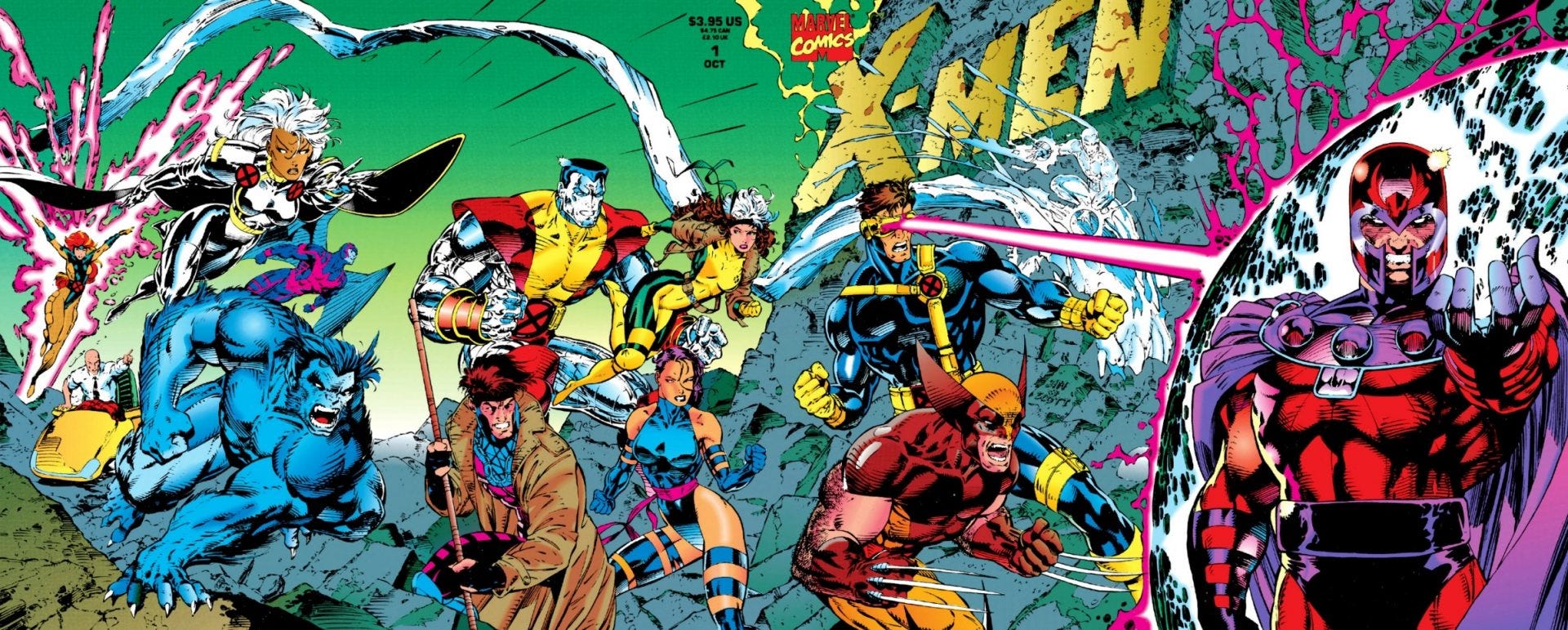
Jim Lee is certainly aware and capable of this-- but even in the practice of these philosophies he somehow subverts them. Dynamic as they may appear-- compositions such as the one for the interlocking series of covers for 1991's X-MEN #1-- tend to flatten out. This forces us to consider each individual X-Man in their fully posed glory and shifts the emphasis to the microscopic— on the dynamism and elegance of the marks Lee makes and the proportions he chooses.
Lee inverts the in-your-face grandiosity you'd expect of a superhero comic-- only to give us something somehow even more EXTRA. We're not being asked to move through the river of images that compose a comic book story but to bathe in them.
Love or hate his approach to this art, the metric by which Jim Lee’s X-Men run will always be measured is its staggering sales numbers.
That volume of exposure and the stage it gave for his art, inspired legions of derivatives. Each seeking to mine something from Lee’s example, with very few doing more than scratching at the surface. And yet, through the billions of small marks they left in their wake, any question of his impact on comics was erased.
Try as he might, teenage Jason was never among them— But in TRYING to re-mixing that famous X-Men cover I mentioned above-- I walked away with a new appreciation for just how much of the artist is in this work. The how and why of how his art does or doesn't work, boils down to Lee imposing HIS point of view. Even here, in work intended to be as broadly appealing as possible, he is risking your refusal by making and expressing his own choices. His version of cool. His version of sexy.
The wish Jim Lee is willing to grant you is one he thinks you and COMICS need. Any regrets you have about accepting or denying it are on you.
Next time: new comics? In the meantime, there’s more X-Men stuff over on THE DRAWL. Links to that are below.
Hope you’re all doing great. Thanks for reading. Much more soon…
-j
WATCH THE DRAWL:
Love the finished cover. A cool contemporary take. The launch of that X-Men comic, Spider Man 2099 and Image comics back in the day was a super exciting time in comics! Jizz in my pants for months!
Cool take on the covers! Always dug how you do Wolverine. I love that your version has Gambit with a cigarette in his mouth! I've never been into any Gambit standalone series or miniseries but I would read a drunk Gambit series!