


03/15/24: DON'T GET CAPTIONED
The music of comics.

Hey y’all,
Like most of you, my early interest in music was chiefly a social pursuit. Maybe a search for a way to articulate my emotions. To find common ground with other kids my age. But somewhere along the way the the isolation of making comics, and the hyper-analytical habits I built to improve at that job— pushed my listening habits into something less passive. Almost aggressively active.
And while tastes vary widely, it doesn’t take much investigation to see that’s pretty true for a lot of writers and artists. Maybe it’s the relative immediacy of expression that both mediums share. Or the mutual love for digging in the crates— cobbling together new meanings from disparate scraps of the old. But comics and music have long seemed overly keen to combine energies. Resulting in a long history of, well, let’s call them passionate dalliances.
There are obvious reasons why the intensity or duration of these meldings has been hit or miss. The gap between mediums that use only your ears or only your eyes being a real doozy.
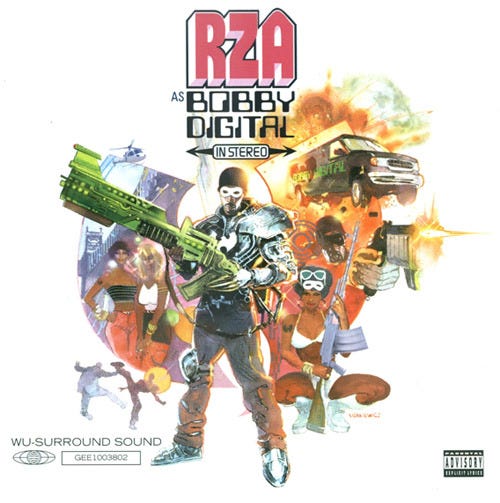
But still, there have been LOTS of amazing comics contributions to the lore and legacy of popular music. Be those album covers, or biographies, or song adaptions. And along the way a few musicians have even come stumbling down our back alleys looking to make comics of their own. (See Gerard Way, KISS, Kid Cudi, etc…)
And of course, there are comics where the characters themselves are musicians— like SCOTT PILGRIM, RED ROCKET 7, DAZZLER, THE WICKED + THE DIVINE, and even a certain radio-active spider-powered drummer.
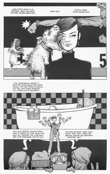
(Above: 'Break The Chain' combined a Kyle Baker comic and a read-along audio cassette/wax vinyl featuring songs performed by KRS-One)
Point here being that despite the fact they’re so seemingly incongruent— comics and music can’t seem to keep from passing love letters in class.
And so somewhere between last week’s post about the good, the bad, and the ugly of standing in portfolio lines and this little off-ramp into music comics—
I was reminded of an old axiom that has always bugged the living shit out of me:
“Good comics storytelling MUST be readable without words.”
No.
That is absolutely not an absolute.
Yes. The ability to draft a clear, efficient, and wordless story IS a baseline, entry-level required comics artist skill.
Yes. The complex and fanciful interplay of words AND pictures that are comics can be judged and admired from many angles.
But. At the end of the day, the only near-objective, near-universal point to the existence of any comic (be it one with a million words or none)—
Is to be read.
As a result— a huge, seemingly invisible hurdle for any comic becomes dealing with the laziness, or general apathy of most readers.
The task of flipping their switch from off to on, from passive to active, is a mighty labor. And unlike a film or a piece of music, which pull you along through time— the pace of reading is controlled exclusively by a filthy no-count lay-about audience.
Too much text or dialog can overwhelm or displace the reader by pushing them away from the art. Too little sometimes risks no engagement at all. And the art— don’t get me started on the potential failings of art.
But the rare comic that can overcome all of that, and somehow influence the pace at which the eye flows through all of the elements on a page? Well, friend, those kinds of comics tend to create a pocket of space, of rhythm, of flow— where image and word sit aligned. Like the lyrics and music of a song.
To achieve this, some comics rely heavily on page composition or panel frequency. Maybe even the cadence of the text itself. Some sacrifice goats or other livestock.
And while the importance of all of these things can’t be overstated, I also tend to believe that one of the most direct methods by which to control the reader’s eye is one of the simplest—
The placement of text.
So with all of that in mind…
Back in the days before the plague, I had the good fortune to officially adapt the track “Don’t Get Captured” by RUN THE JEWELS as a comic for Paste Magazine.
In that comic, I tried to play with the idea of a total investment in the assumption that the viewer WANTS to read, and WILL flow with the lyrics.
(Click to enlarge:)
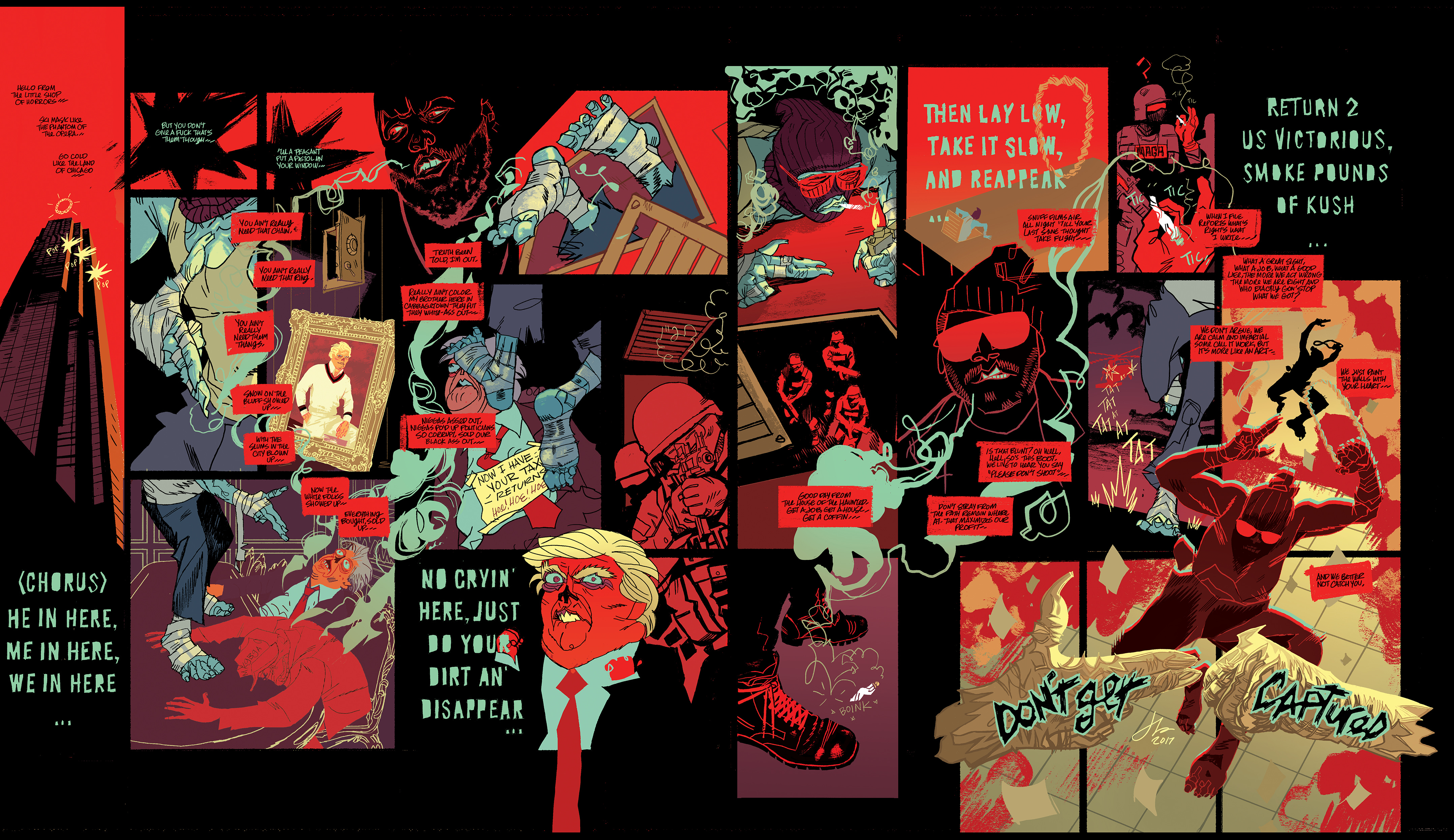
Abandoning the zig-zag of the expected left-to-right, top-to-bottom page composition, my notion was to try and guide the reader through the madness expressed in both song and comic, by using elements like the smoke motif, the color, and the individual panel compositions.


Looking back on it, I’m not so sure how successful it is. Especially if you’re not familiar with the song. And the translation to digital spaces isn’t helped by the fact that in terms of physical dimensions— PASTE is a rather large magazine. (Meaning the text doesn't look so small in print.)
Were I given a redo, perhaps a larger text, or a different color for the caption boxes, might provide more negative space for those lyrics to rest and guide the eye.
Of course, there would be losses and gains with any changes. And at the end of the day, my main hope was the same as it always is—
To make a comic that feels more like music than math.
Alright, I’ve rambled enough for this week. And should really get out of here before I do something dumb like try to write rap lyrics.
Please, please, please smash those like and share buttons below the post— as they go a lot farther than they should, and will be quite vital to the mysterious publishing plans ahead. And by all means, drop some of your favorite music comics in the comments. I’m always eager for suggested reading.
Hope y’all have a great weekend. More soon…
-j
Not sure I agree ENTIRELY with your post; some GREAT comics are wordless, but holy fuck that's some stunning ART!!!!! Does that spread exist as a print??? Can't believe you created stuff this good and it didn't get a wider audience; breathtaking.